Branding, Copywriting
00. Process
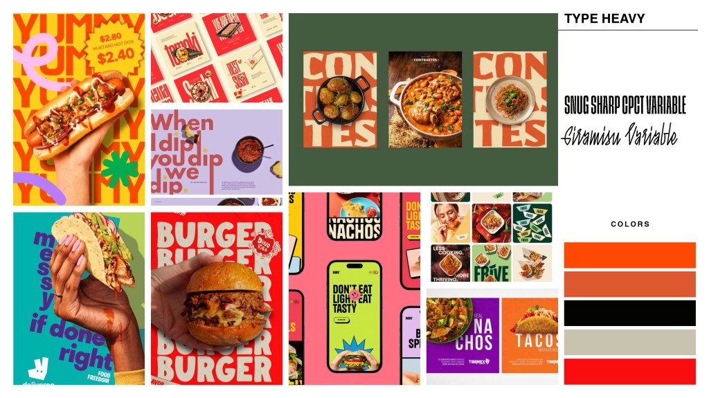
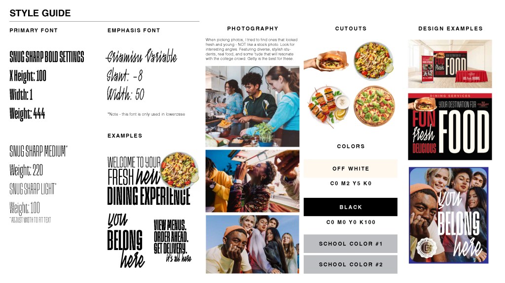
The goal was to develop a campaign that captured students’ attention and built excitement around campus dining. Since the design needed to be adaptable to each school’s colors, the layout was created to be bold yet simple. The tagline was intentionally kept broad and versatile, ensuring it could seamlessly support larger campaigns across a wide range of college campuses.
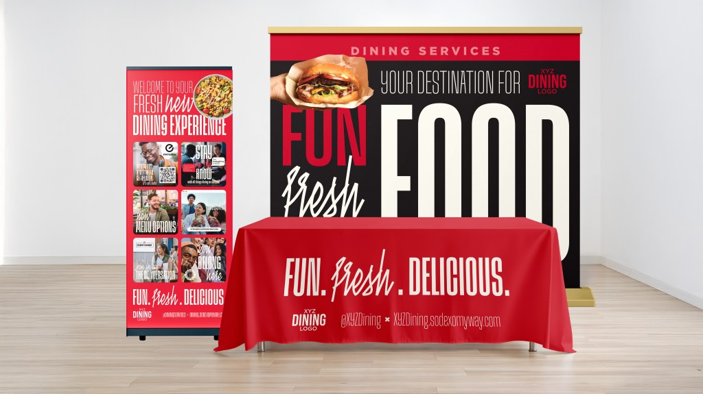
01. Table Spread
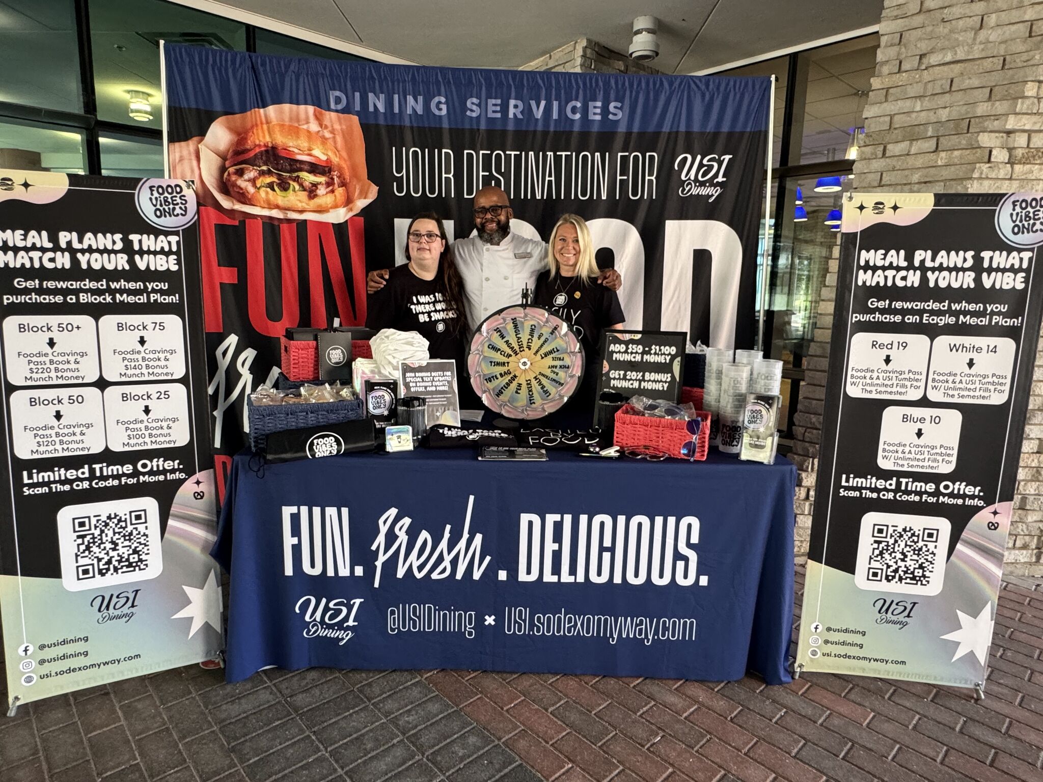
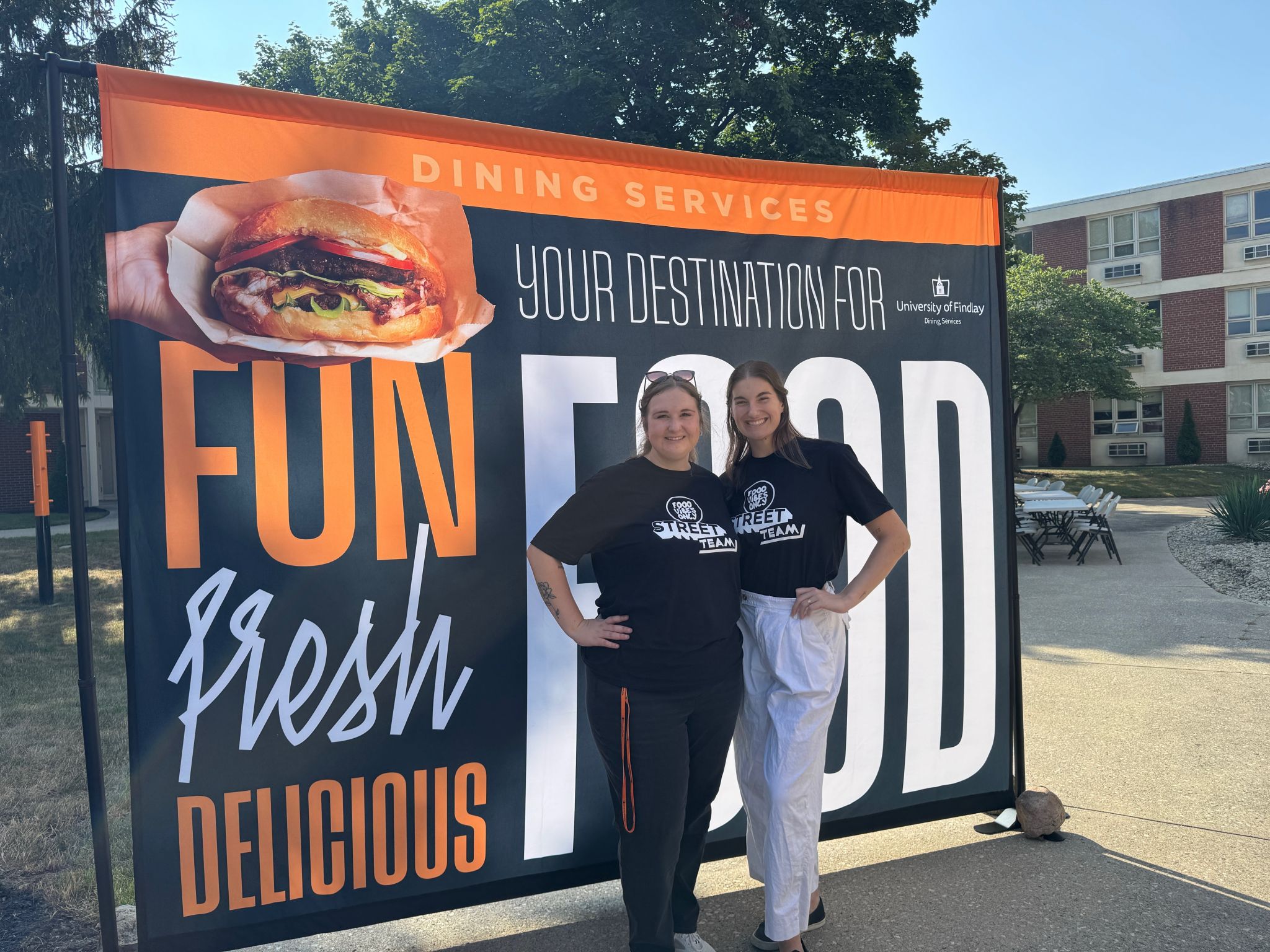
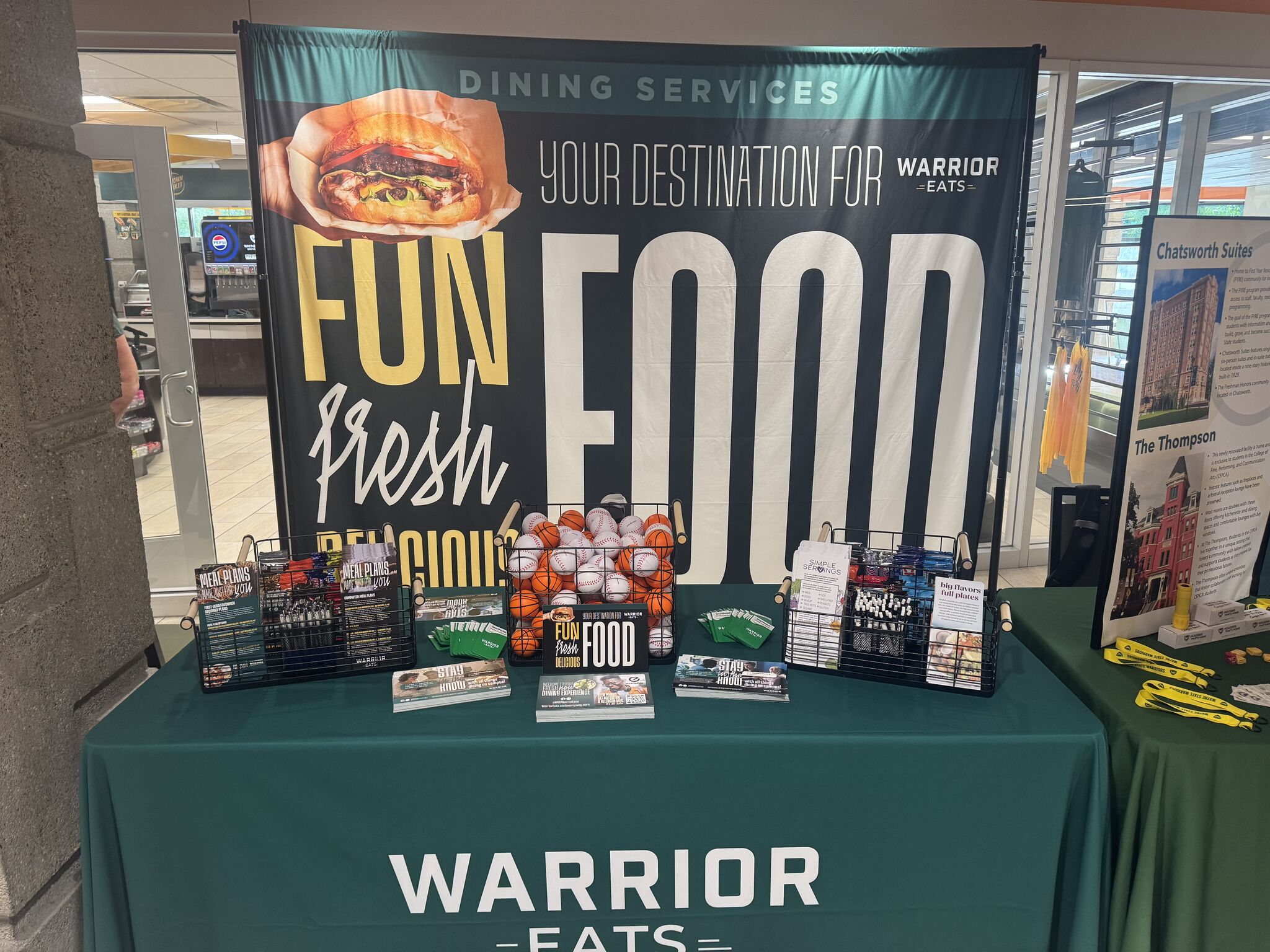
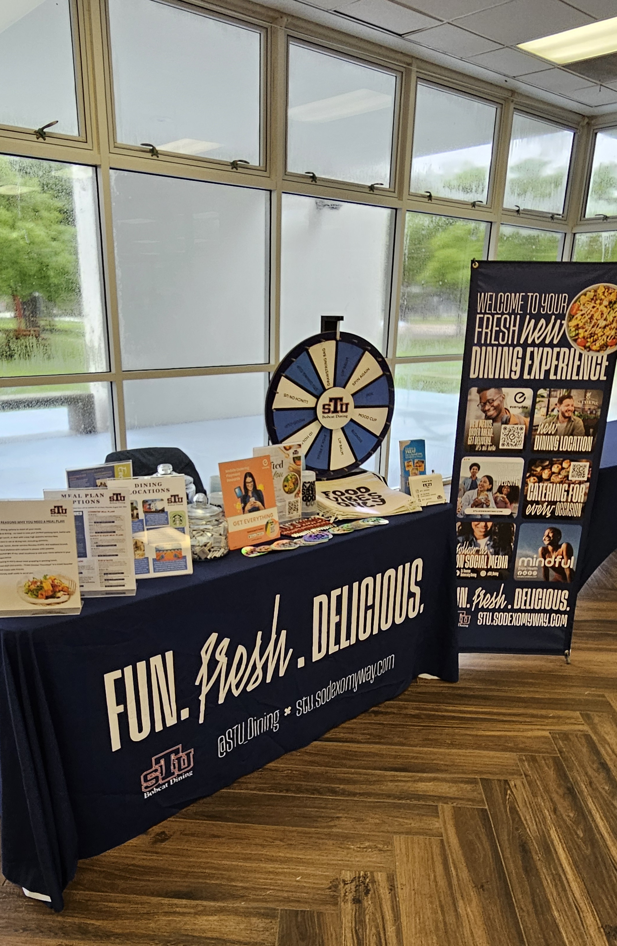
The campaign’s larger elements use bright, bold lettering designed to capture students’ attention. Incorporating primary school colors ensures the materials blend seamlessly into any campus tabling event, while the playful typography creates a distinctive look that stands out against a backdrop of university-branded displays.
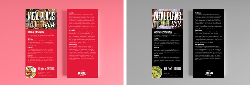
02. Additional Assets
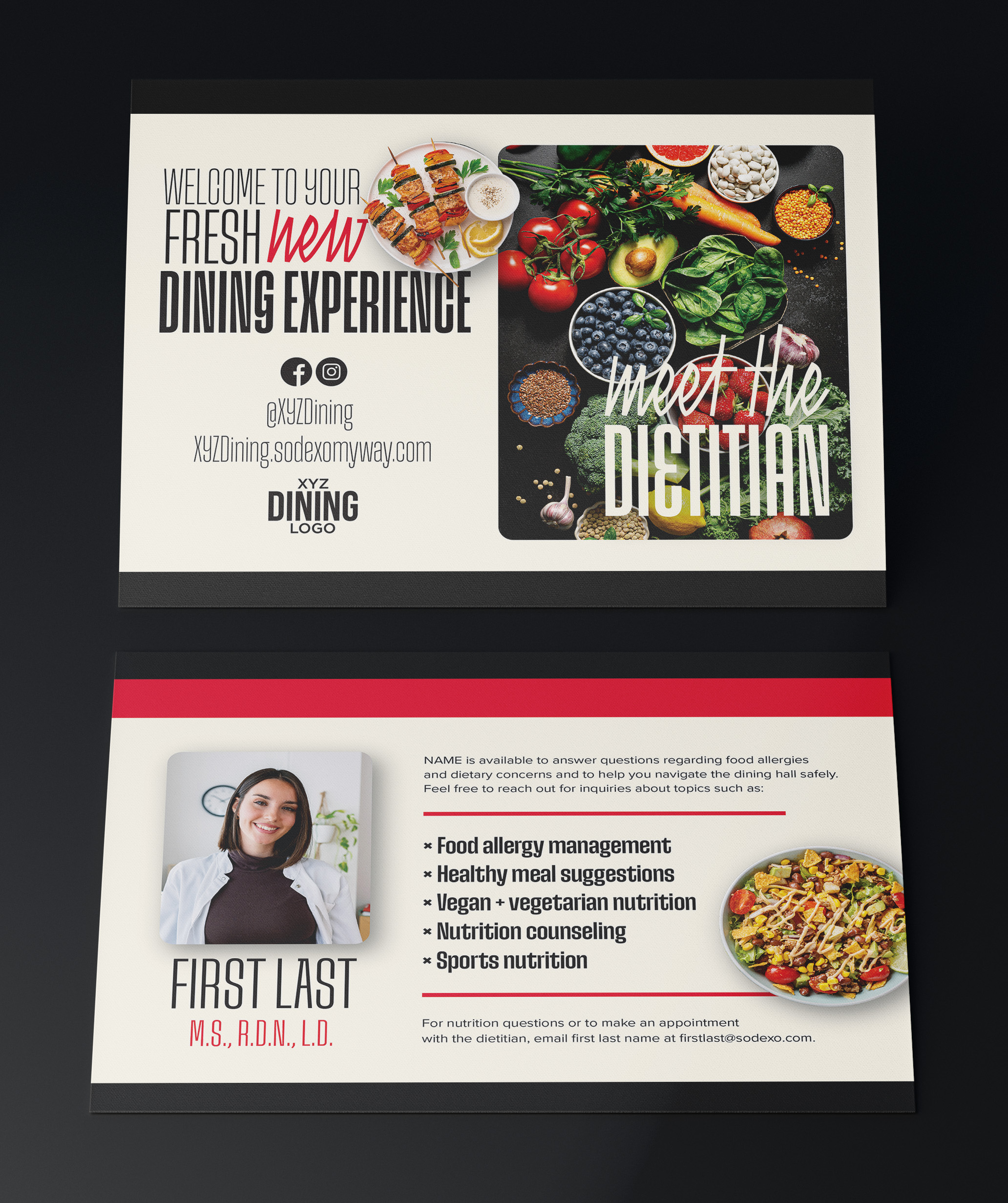
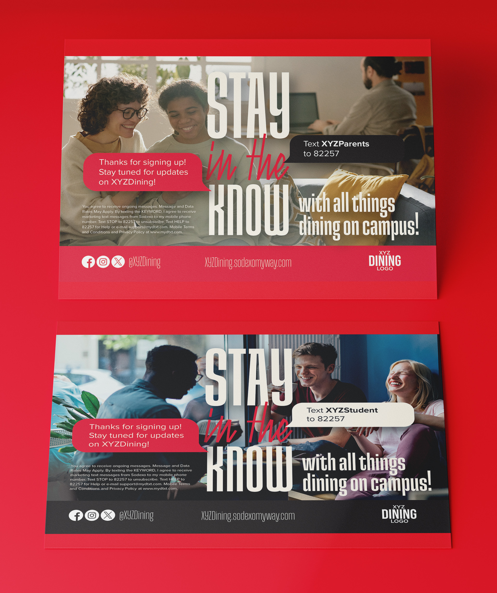
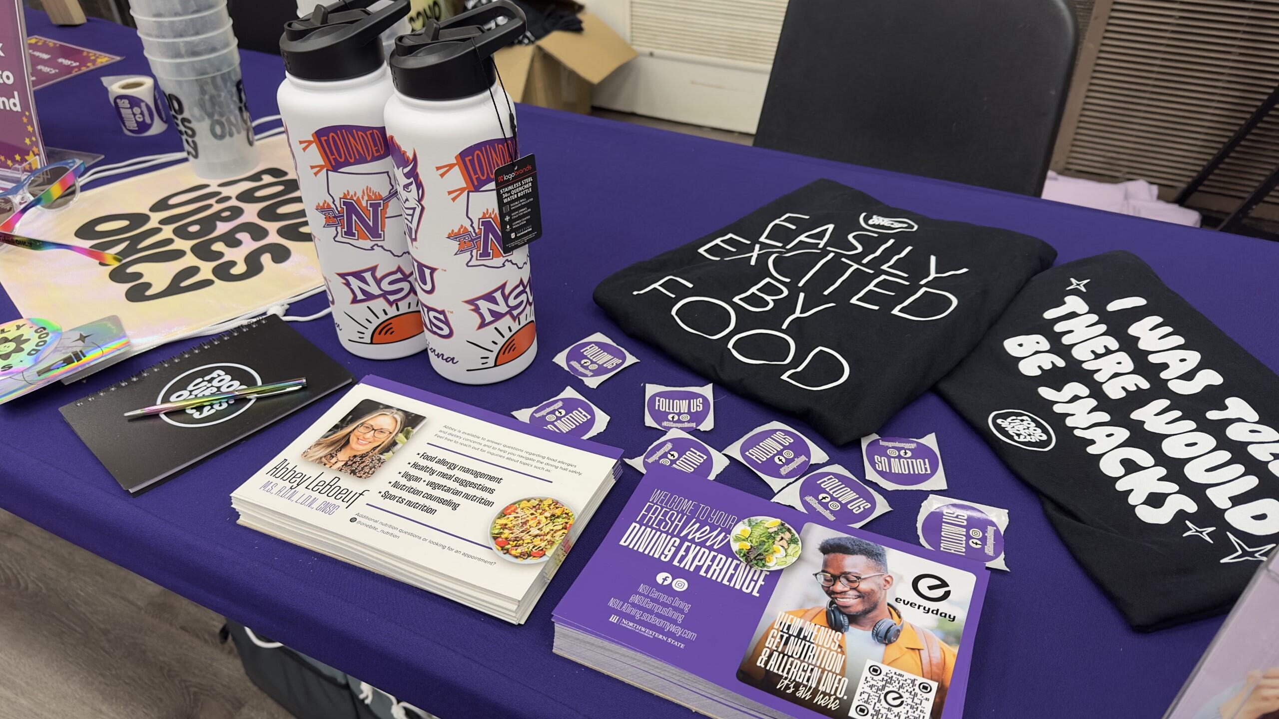
The postcards were designed to mirror the larger campaign visuals while effectively communicating key information. Their compact format makes them easy and cost-efficient for schools with limited printing capabilities, and each tabling kit includes fun stickers to encourage social media engagement.

03. In Use
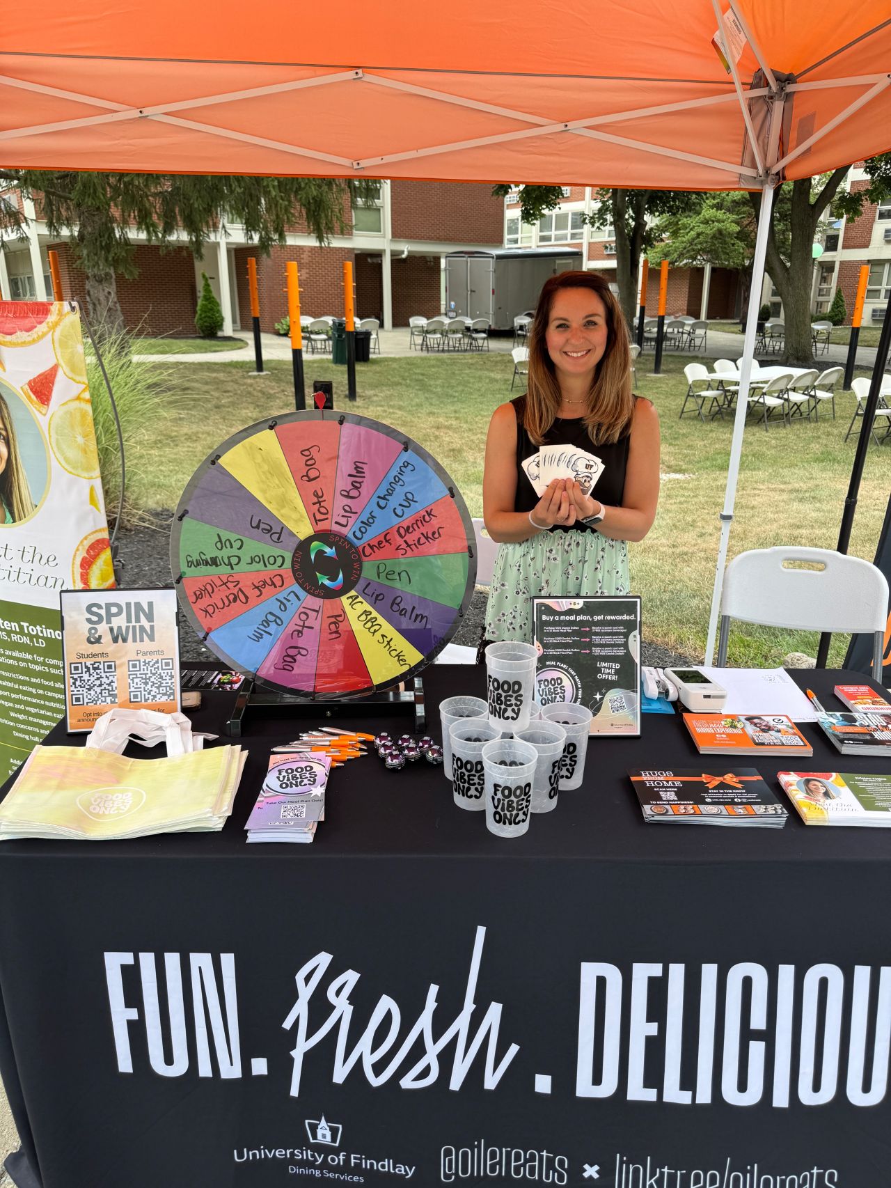
Since launch, the design has been adopted by 239 college dining programs nationwide. Through efficient collaboration and streamlined production, our team delivered every order on time, ensuring full implementation before the Fall 2025 semester.


Leave a comment