Brand Identity, Illustration
00. Process
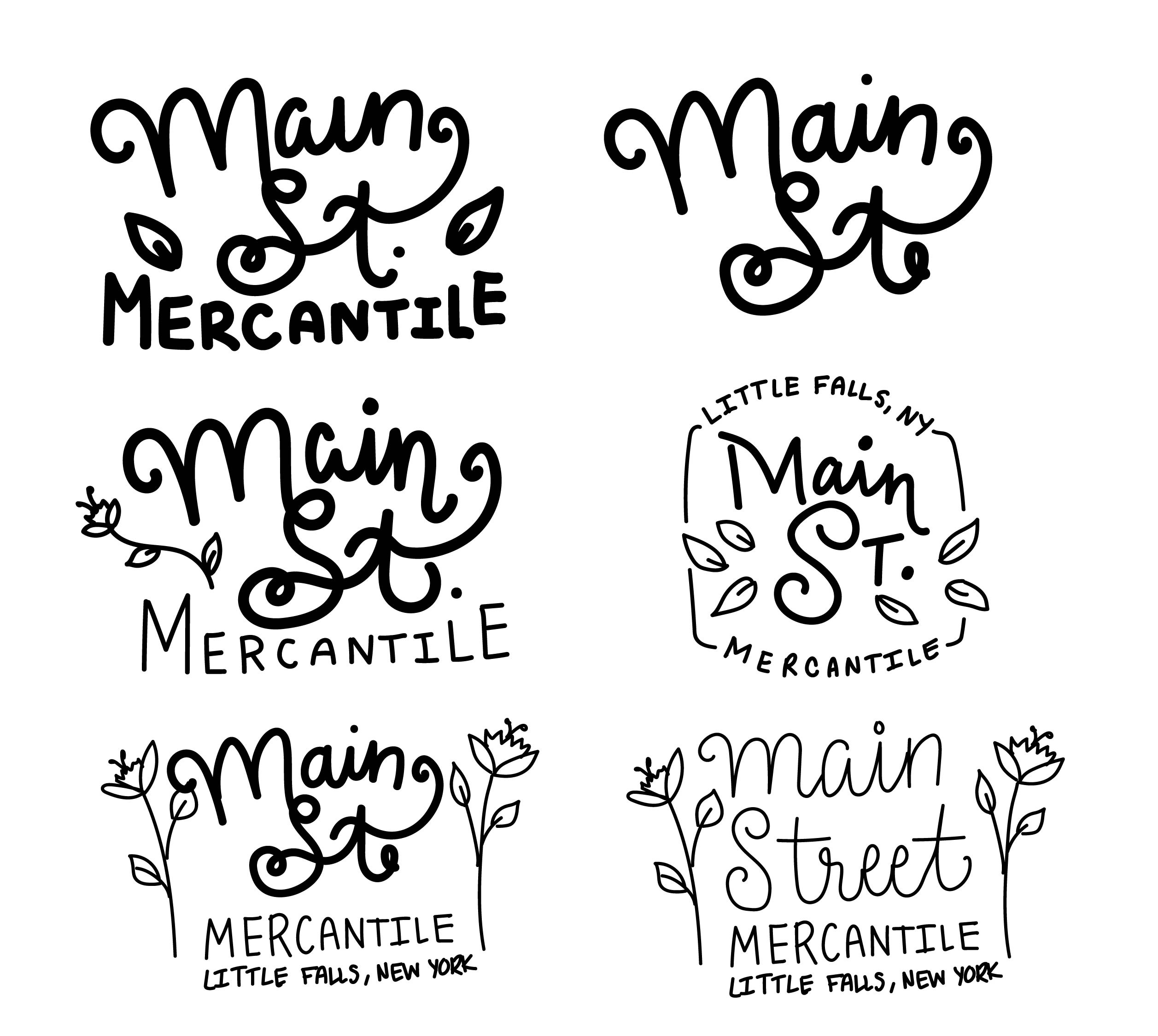
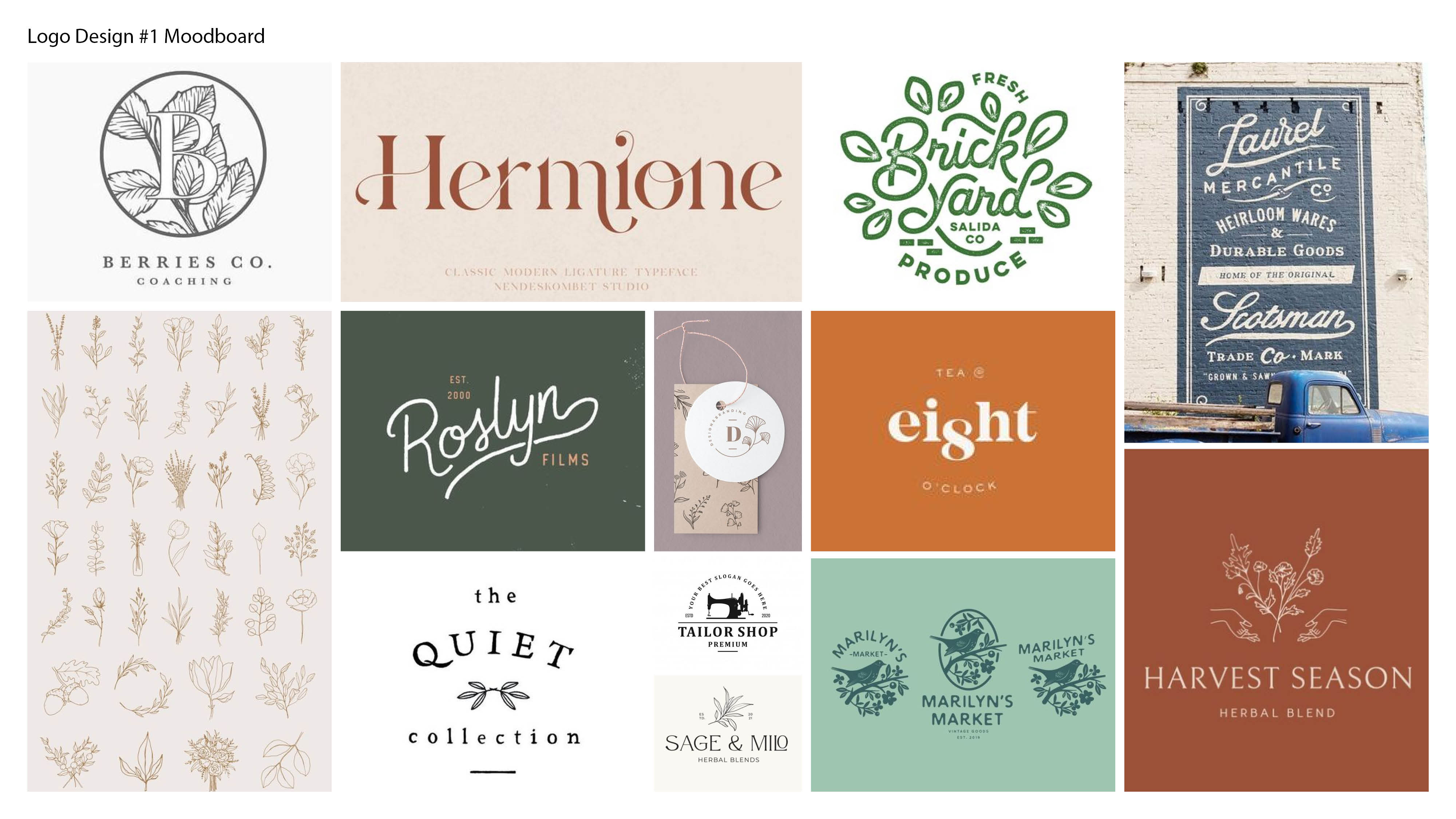
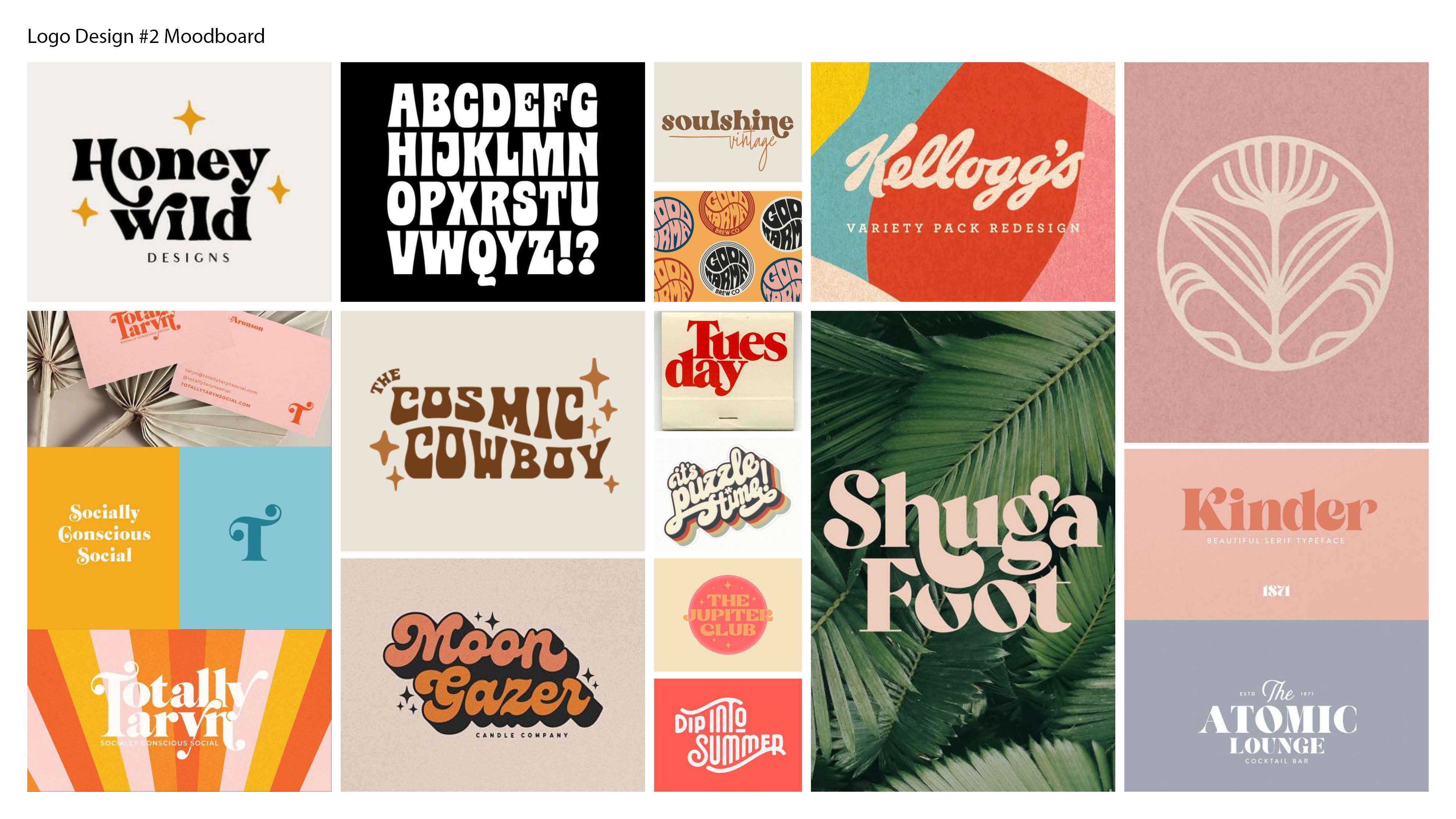
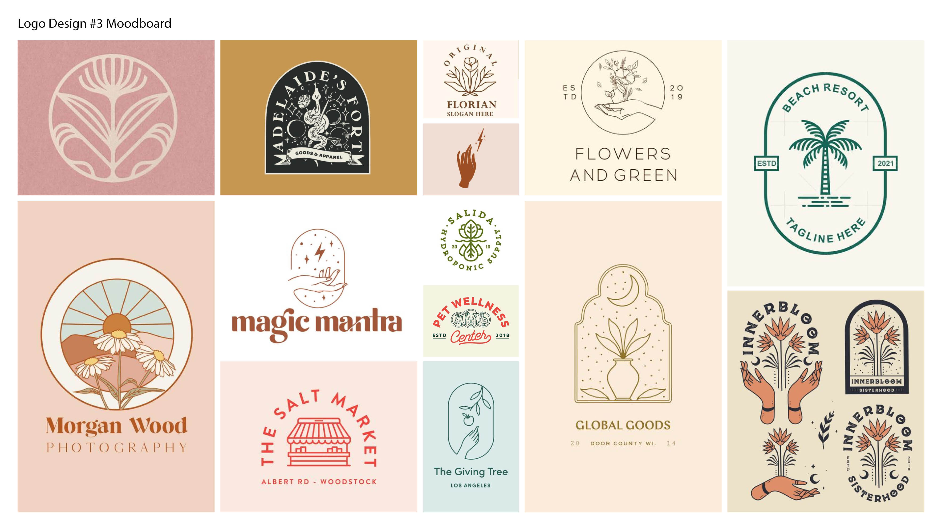
Client enjoyed botanical illustrations, lighter serif fonts, hand drawn type, vintage design, light illustrations.
01. Main Logo
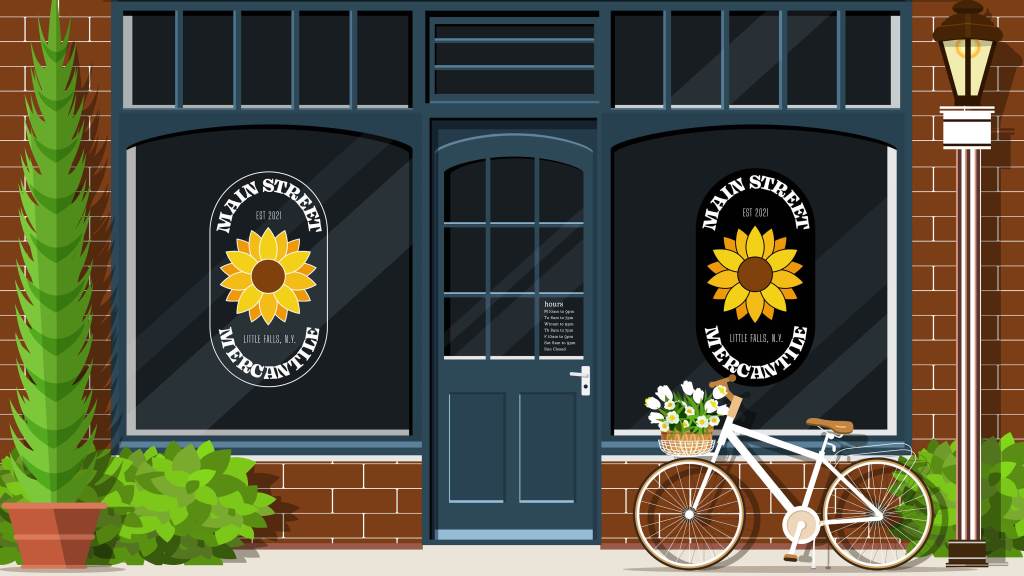
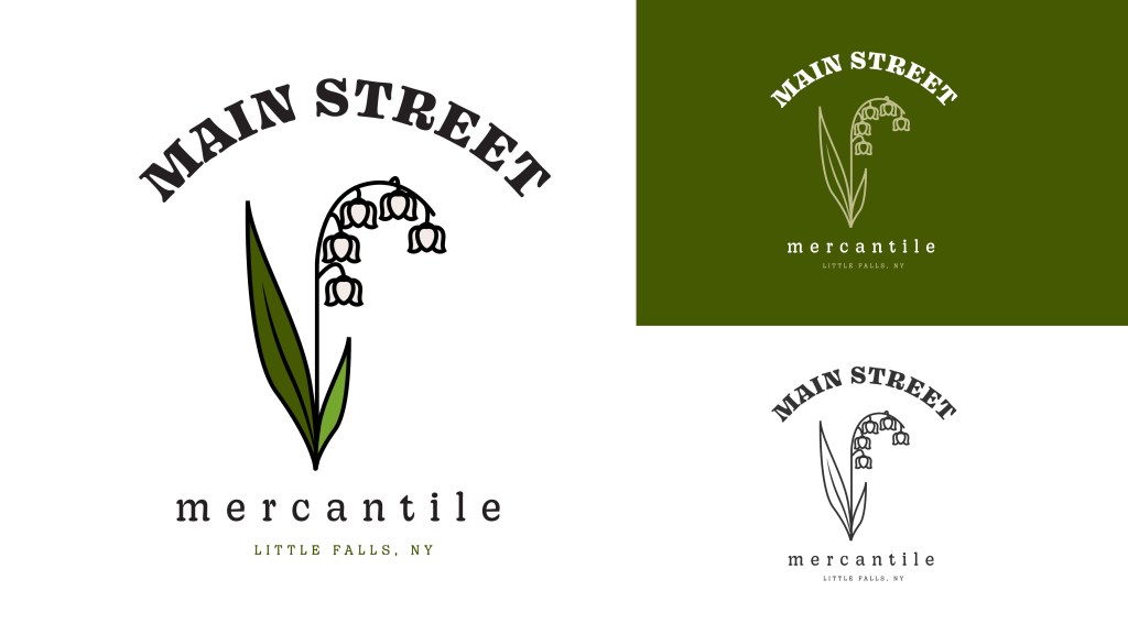
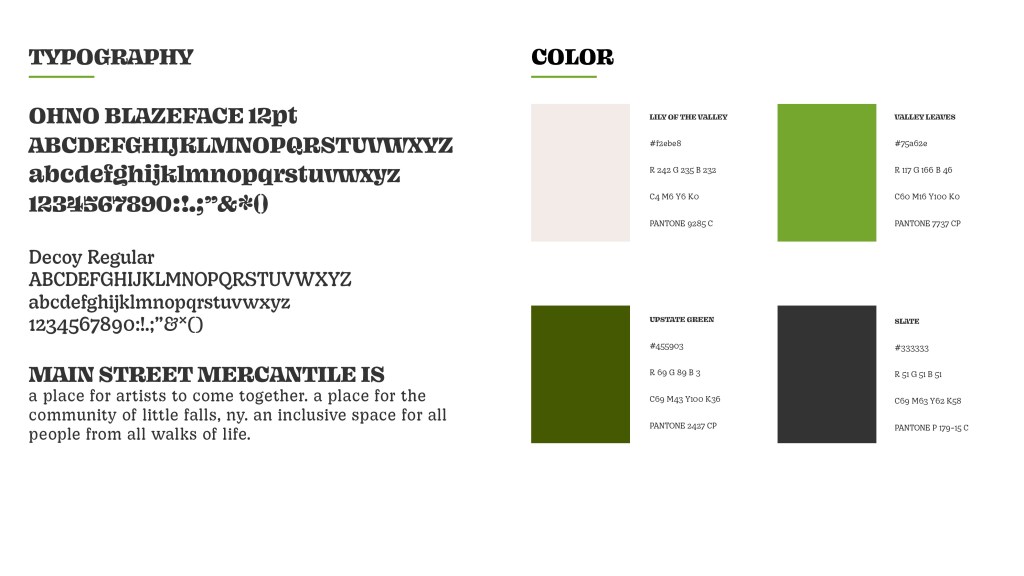
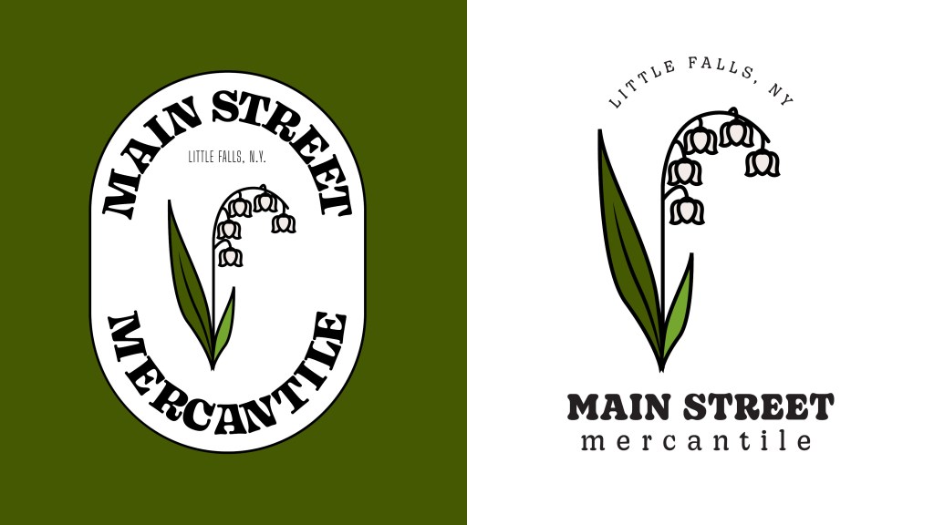
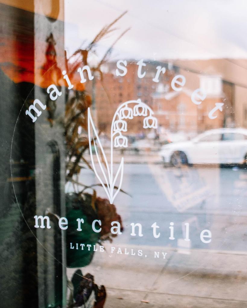
The goal of this logo and brand identity was to create something friendly, recognizable, and subtly feminine. The final design needed to be clean and scalable, while still feeling warm and inviting—an aesthetic that complements the charm of Little Falls’ quaint downtown.
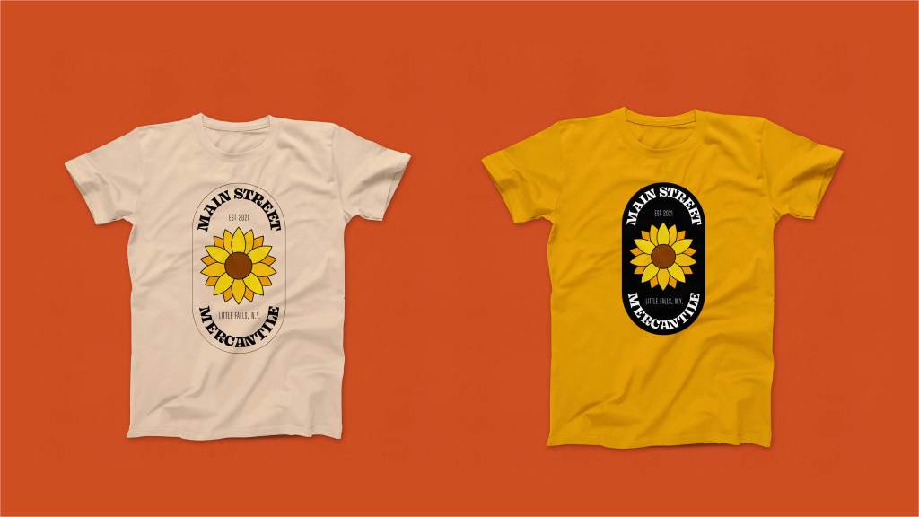
02. Merchandising
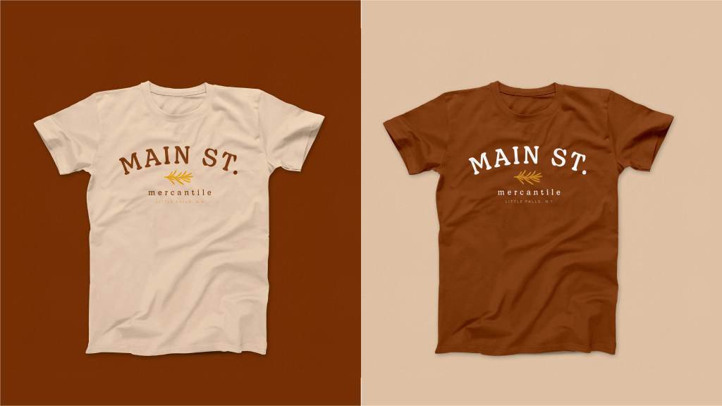
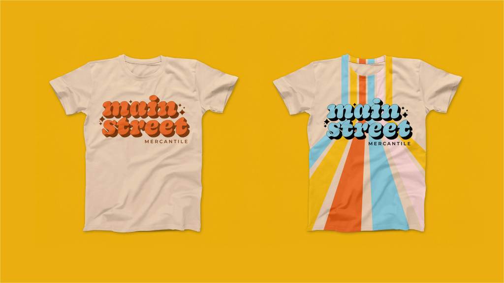
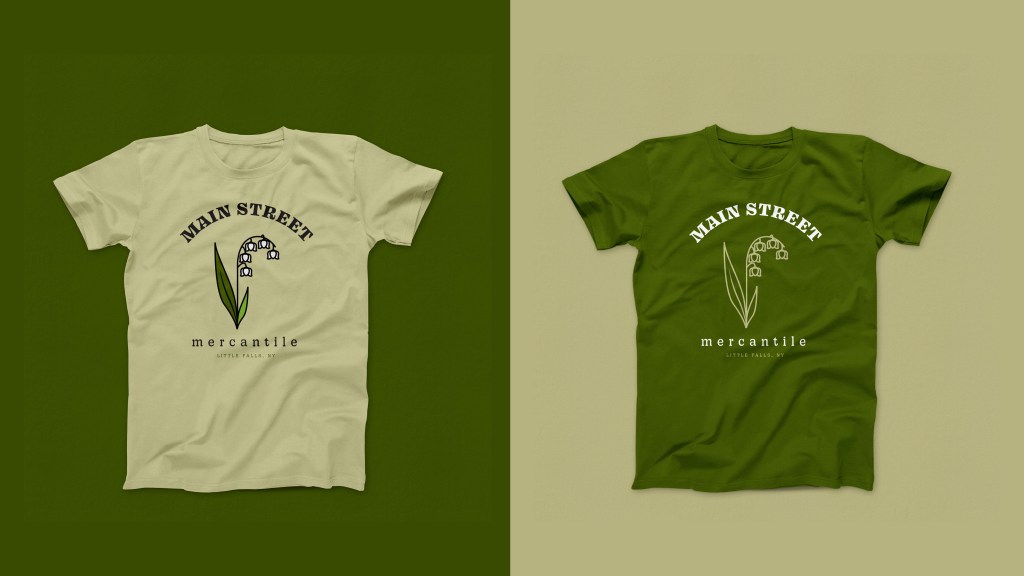
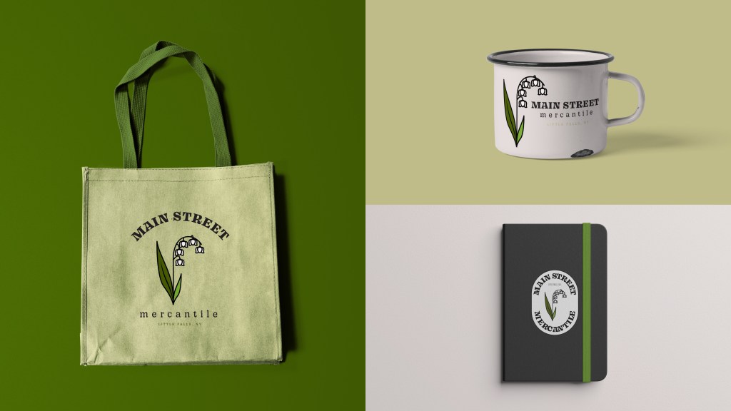
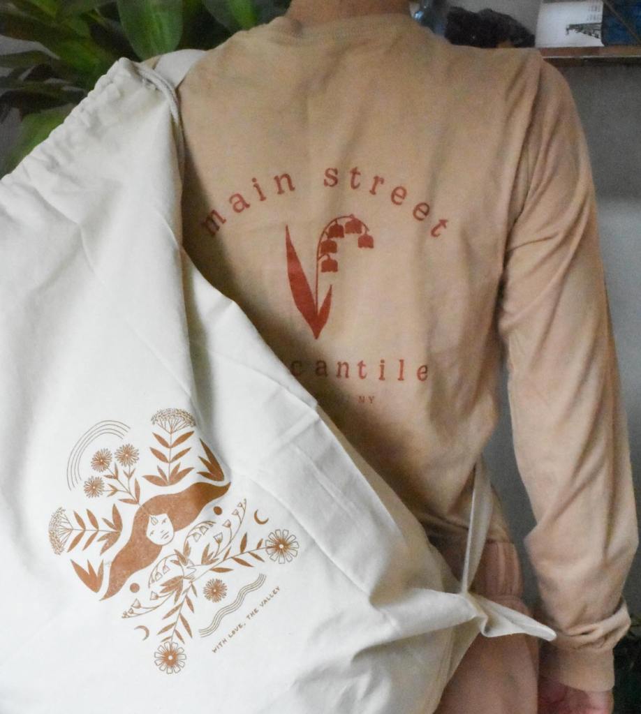
Another key goal for the logo and branding was adaptability for merchandise sold in-store. By incorporating alternative logo variations and layouts, the design maintains versatility while remaining instantly recognizable.
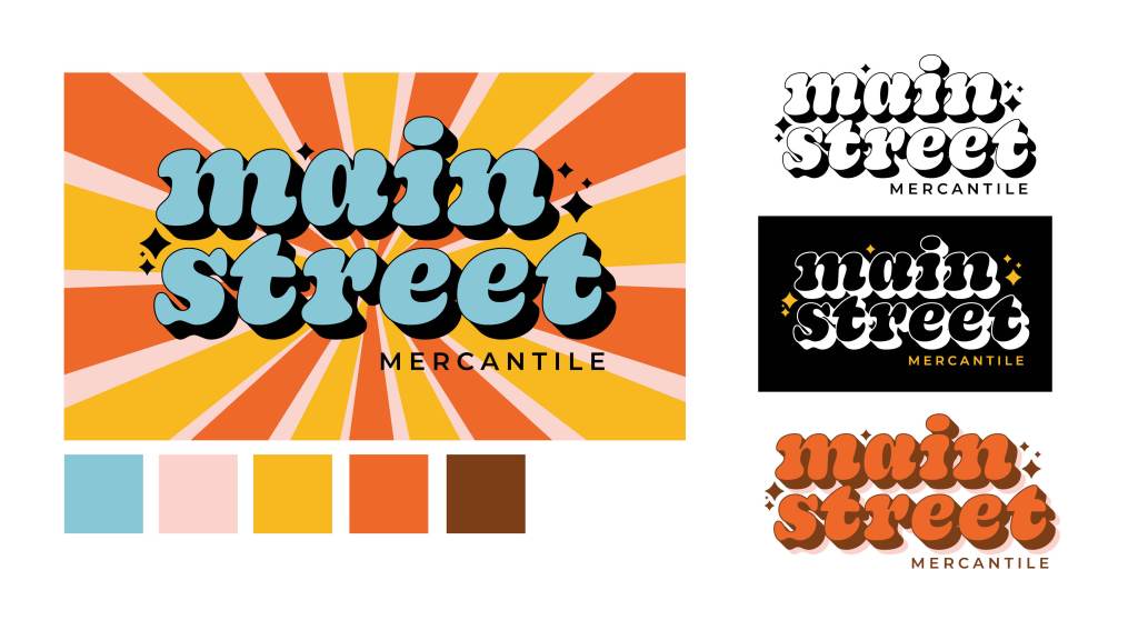
03. Alternative Logos
In situations where the primary logo isn’t the best fit, these alternative versions preserve the brand identity while adapting to different applications.
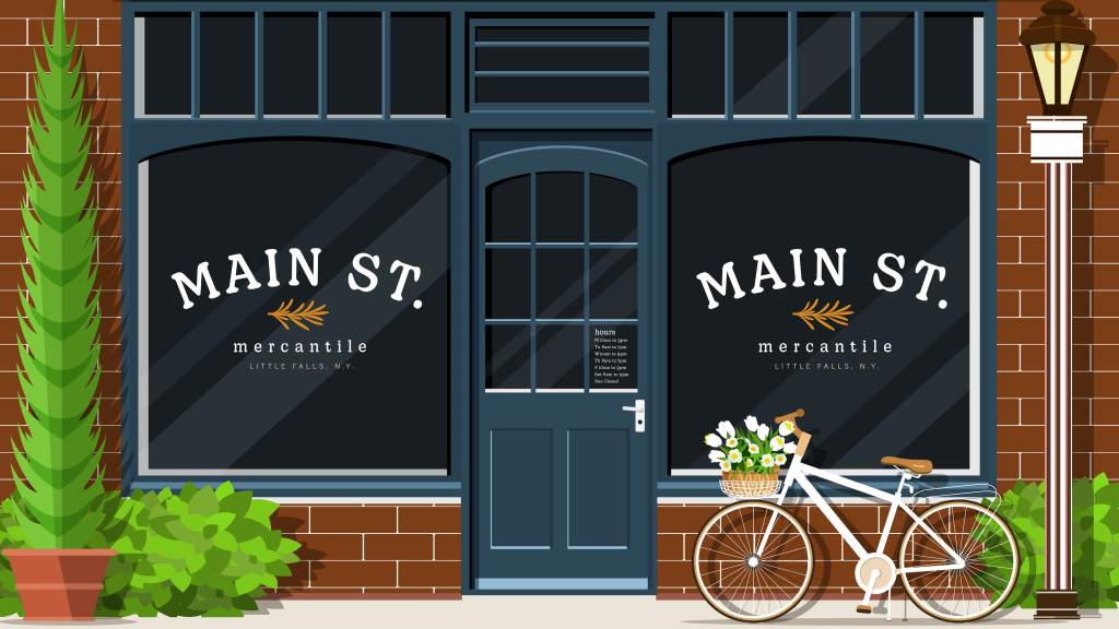
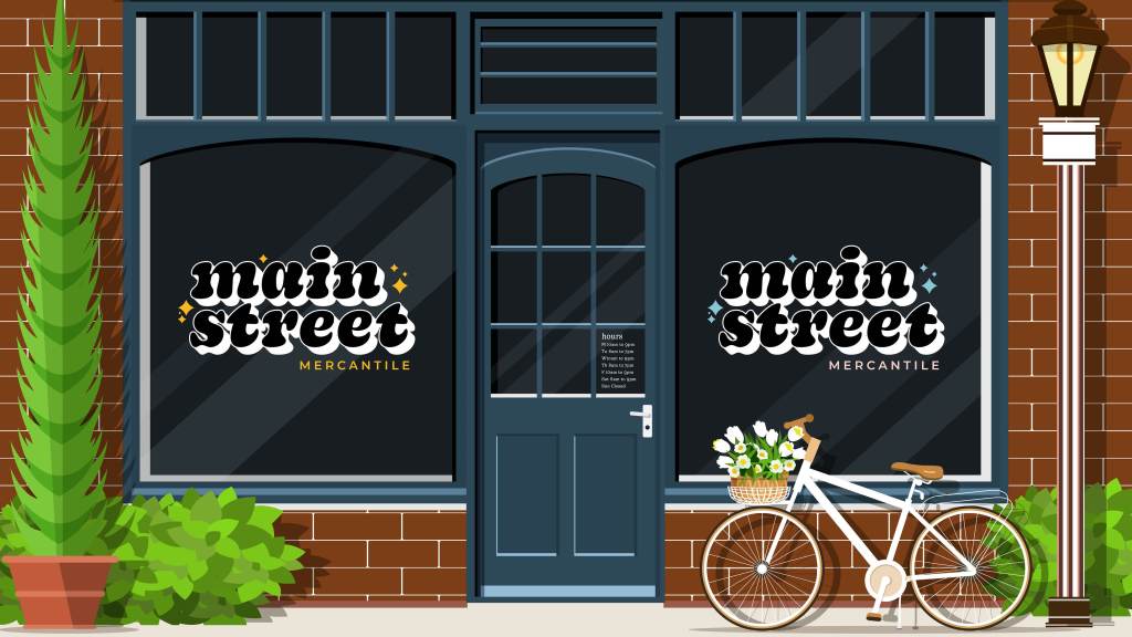
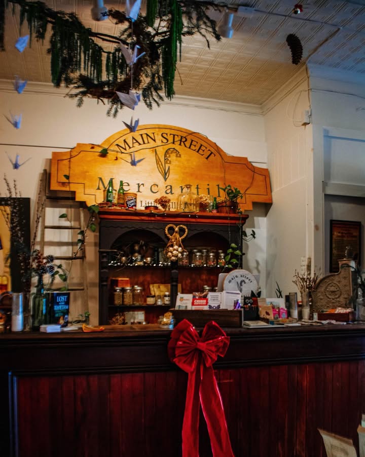
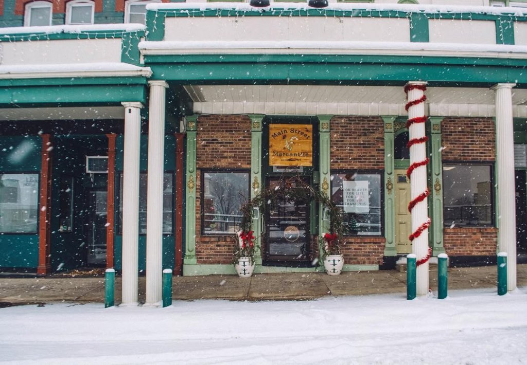
04. In Use


Leave a comment